Functions for controlling the layout
Todo
- Distinction between standard construction vs. 2D pages
Each page element (= page of the visualization) is basically divided into 12 columns. This also applies when using a navbar on the left or right side. In this case, the page element occupies a narrower area on the screen, but still has 12 columns.
The most important element for influencing the overall layout is the `` layout`` child element, which is available in all visible widgets. In the following example, the line widget lists all the attributes that are explained in more detail in the following sections:
| Element | Attribute | |||
|---|---|---|---|---|
| Structure | Name | Content | Description | |
|
colspan | decimal | Amount of coloumns this widget sould be wide. | |
| colspan-m | decimal | Overrules the amount of coloumns on a medium screen. | ||
| colspan-s | decimal | Overrules the amount of coloumns on a small screen. | ||
| rowspan | decimal | Amount of rows this widget should be high. | ||
| x | string | Horizontal position of the widget for 2D pages. | ||
| x-s | string | Horizontal position of the widget for 2D pages on a small screen. | ||
| x-m | string | Horizontal position of the widget for 2D pages on a medium screen. | ||
| y | string | Vertical position of the widget for 2D pages. | ||
| y-s | string | Vertical position of the widget for 2D pages on a small screen. | ||
| y-m | string | Vertical position of the widget for 2D pages on a medium screen. | ||
| z | string | Reserved for future use. | ||
| width | string | Width for the widget for 2D pages. | ||
| width-s | string | Width for the widget for 2D pages on a small screen. | ||
| width-m | string | Width for the widget for 2D pages on a medium screen. | ||
| scale | true or false | Enable/Disable scaling layout values relative to backdrop on 2d pages (default: true). | ||
| scale-s | true or false | Enable/Disable scaling layout values relative to backdrop on 2d pages on a small screen (default: true). | ||
| scale-m | true or false | Enable/Disable scaling layout values relative to backdrop on 2d pages on a medium screen (default: true). | ||
The attribute colspan
Colspan determines how many columns the widget should occupy
on a large display. The default value is colspan="6",
if not specified. This sets the widget width to half the page size.
Thus, two widgets fit next to each other, only then is the next row
started with the next widget.
The Colspan attribute may also contain non-integer information, but it should be noted (for visual reasons) that the sum of the colspan definitions per row returns 12.
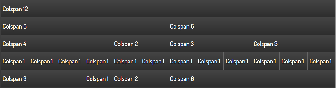
Simple text widgets with different colspan values
The special case colpan="0" creates a widget with the minimum
width of the content.
For each widget, colspan-m or colspan-s can also be used to
specify a widget width for smaller displays. This is necessary because
in practice the font size and the size of the control surfaces
(e.g. button size) scale differently than the actual display size.
Furthermore, colspan-m and colspan-s can also affect the layout
in portrait format, if the same config is used on several devices
or if the display should be rearranged on a device when the
screen is rotated.
Important
Whether a display is recognized as normal, medium or small depends not on the physical resolution of the display, but on the viewport size, which is defined for each device based on the display size (screen size). An overview provides eg.`<viewportsizes.com>`__
An example is shown below in which the widgets are arranged differently on 3 display sizes.
<text>
    <layout colspan="3" colspan-m="6" colspan-s="12" rowspan="1"/>
    <label>Colspan 3/6/12, Rowspan 1</label>
</text>
<text>
    <layout colspan="3" colspan-m="6" colspan-s="12" rowspan="1"/>
    <label>Colspan 3/6/12, Rowspan 1</label>
</text>
<text>
    <layout colspan="3" colspan-m="6" colspan-s="12" rowspan="1"/>
    <label>Colspan 3/6/12, Rowspan 1</label>
</text>
<text>
    <layout colspan="3" colspan-m="6" colspan-s="12" rowspan="1"/>
    <label>Colspan 3/6/12, Rowspan 1</label>
</text>
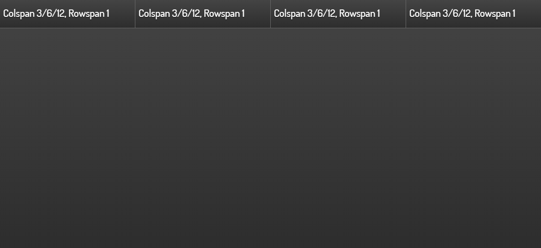
Representation at a resolution of 1100x640
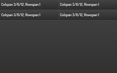
Representation at a resolution of 640x400 (Smartphone in landscape mode)
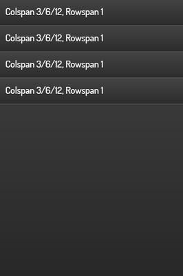
Representation at a resolution of 400x640 (Smartphone in portrait mode)
The attribute rowspan
Rowspan determines the number of lines a widget occupies. Currently
only integer statements are allowed for rowspan. Most widgets
do not require rowspan because the default value rowspan="1"
is sufficient.
Necessary or meaningful may be the specification for the following widgets:
- Image
- Web
- Rsslog- and Rss-plugin
- Diagram-plugin
- Group
In the example below, the rowspan="5" forces the image widget
to be the same as the five individual widgets on the left.
Image-Widget with rowspan=”5”
Because the widget arrangement is one after the other in rows,
using different values for rowspan can create empty areas.
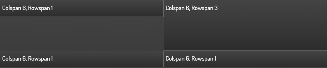
Empty areas in interaction with the rowspan element
In such cases, the use of the Group widget in conjunction with the nowidget attribute can be remedied.
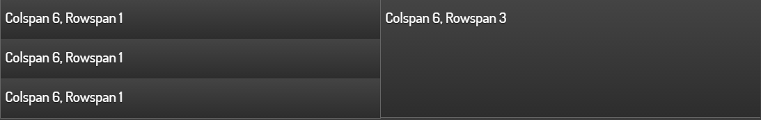
Control of the arrangement with an invisible group(Attribut nowidget="true")
Below the xml code for the screenshot with the correct arrangement.
<group nowidget="true">
    <layout colspan="6"/>
    <text>
        <layout colspan="6" rowspan="1"/>
        <label>Colspan 6, Rowspan 1</label>
    </text>
    <text>
        <layout colspan="6" rowspan="1"/>
        <label>Colspan 6, Rowspan 1</label>
    </text>
    <text>
        <layout colspan="6" rowspan="1"/>
        <label>Colspan 6, Rowspan 1</label>
    </text>
</group>
<text>
    <layout colspan="6" rowspan="3"/>
    <label>Colspan 6, Rowspan 3</label>
</text>