The ImageTrigger widget
Description
Adds an image like the {@link cv.ui.structure.pure.Image} widget, but additionally the image can be changed by incoming data and can send data to the backend by clicking on it. There are two modes to react on incoming data:
type="show": Hides the image when incoming data === 0type="select": Changes the image by appending the incoming data to the initial configured image source, or hide it when incoming data === 0
Example:
<imagetrigger src="resource/icon/comet" suffix="svg" sendValue="clicked" type="select">
   <address transform="DPT:16.001" mode="readwrite">0/0/0</address>
</imagetrigger>
initially shows nothing. When the CometVisu receives the string _icon in address 0/0/0,
the image icon/comet_opt_icon.svg is shown. When the CometVisu receives ‘0’ on address 0/0/0,
this image is hidden.
Settings
For a general understanding of how the configuration files are structured and what elements and attributes are it is recommended to read this section first: Pages and structure of CometVisu.
The behaviour and appearance of the ImageTrigger widget can be influenced by using certain attributes and elements. The following tables show the allowed attributes and elements and their possible values. The screenshots show, how both can be edited in the editor.
Attributes underlined by ..... are mandatory, all the others are optional and be omitted.
Allowed attributes in the ImageTrigger-element
| Element | Attribute | |||
|---|---|---|---|---|
| Name | Content | Description | ||
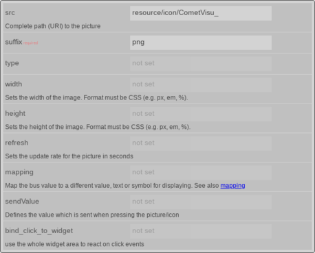
| imagetrigger | src | URI | Complete path (URI) to the picture | |
| suffix | string | |||
| type | string | |||
| width | dimenstion (number+unit) | Sets the width of the image. Format must be CSS (e.g. px, em, %). | ||
| height | dimenstion (number+unit) | Sets the height of the image. Format must be CSS (e.g. px, em, %). | ||
| refresh | decimal | Sets the update rate for the picture in seconds | ||
| mapping | string | Map the bus value to a different value, text or symbol for displaying. See also Mapping | ||
| sendValue | string | Defines the value which is sent when pressing the picture/icon | ||
| flavour | string | Selection of a display variant. See also Flavour. | ||
| bind_click_to_widget | true or false | use the whole widget area to react on click events | ||
Attributes in the editor (simple view) [1]
Allowed child-elements und their attributes
| Element | Attribute | |||
|---|---|---|---|---|
| Structure | Name | Content | Description | |
|
colspan | decimal | Amount of coloumns this widget sould be wide. | |
| colspan-m | decimal | Overrules the amount of coloumns on a medium screen. | ||
| colspan-s | decimal | Overrules the amount of coloumns on a small screen. | ||
| rowspan | decimal | Amount of rows this widget should be high. | ||
| x | string | Horizontal position of the widget for 2D pages. | ||
| x-s | string | Horizontal position of the widget for 2D pages on a small screen. | ||
| x-m | string | Horizontal position of the widget for 2D pages on a medium screen. | ||
| y | string | Vertical position of the widget for 2D pages. | ||
| y-s | string | Vertical position of the widget for 2D pages on a small screen. | ||
| y-m | string | Vertical position of the widget for 2D pages on a medium screen. | ||
| z | string | Reserved for future use. | ||
| width | string | Width for the widget for 2D pages. | ||
| width-s | string | Width for the widget for 2D pages on a small screen. | ||
| width-m | string | Width for the widget for 2D pages on a medium screen. | ||
| scale | true or false | Enable/Disable scaling layout values relative to backdrop on 2d pages (default: true). | ||
| scale-s | true or false | Enable/Disable scaling layout values relative to backdrop on 2d pages on a small screen (default: true). | ||
| scale-m | true or false | Enable/Disable scaling layout values relative to backdrop on 2d pages on a medium screen (default: true). | ||
| Element | Attribute | |||
|---|---|---|---|---|
| Structure | Name | Content | Description | |
|
name | string | ||
| type | string | |||
| flavour | string | Selection of a display variant. See also Flavour. | ||
| color | string | |||
| styling | string | Change the color of the dispayed value depending on its value. See also Styling | ||
| class | string | Add this value to the CSS class so that it can be formated by a user provided style sheet. | ||
|
string | Text to display a label for the widget. | ||
| Element | Attribute | |||
|---|---|---|---|---|
| Structure | Name | Content | Description | |
|
transform | string | ||
| mode | disable, read, write or readwrite | |||
| variant | string | |||
| format-pos | decimal | |||
|
string | The GA (like: 12/0/7) for KNX-backends or the item name for openHAB-backend | ||
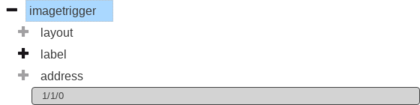
Elements in the editor
Examples
It is possible to manually edit the visu_config.xml and add an entry for the ImageTrigger widget.
Caution
Make sure that you only use UTF-8 encoded characters by settings the encoding in your XML-editor to UTF-8 mode!
<imagetrigger src="resource/icon/CometVisu_" suffix="png" sendValue="clicked" type="select" width="45px" height="32px">
   <layout colspan="1"/>
   <address transform="DPT:16.001" mode="readwrite">0/0/0</address>
 </imagetrigger>
<imagetrigger src="resource/icon/CometVisu_orange" suffix="png" sendValue="clicked" type="show" width="45px" height="32px">
   <layout colspan="0"/>
   <address transform="DPT:1.001" mode="readwrite">0/0/0</address>
 </imagetrigger>
Footnotes
| [1] | The simple view might not show everything. To see all elements/attributes use the expert view. |