The Roundbar widget
Description
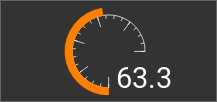
Adds a display to the visu that can represent values from the BUS and shows them with a round bar.
The design can the set in many different details:
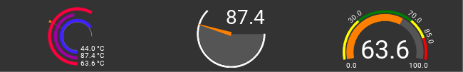
Example for complex Roundbar widgets
Settings
For a general understanding of how the configuration files are structured and what elements and attributes are it is recommended to read this section first: Pages and structure of CometVisu.
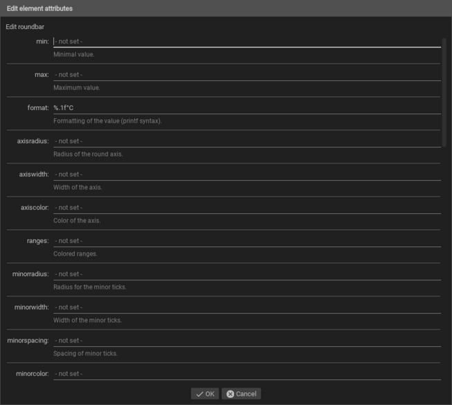
The behaviour and appearance of the Roundbar widget can be influenced by using certain attributes and elements. The following tables show the allowed attributes and elements and their possible values. The screenshots show, how both can be edited in the editor.
Attributes underlined by ….. are mandatory, all the others are optional and can be omitted.
Allowed attributes in the Roundbar-element
Element |
Attribute |
|||
|---|---|---|---|---|
Name |
Content |
Description |
||
roundbar |
min |
decimal |
Minimal value. |
|
max |
decimal |
Maximum value. |
||
format |
string |
Formatting of the value (printf syntax). |
||
axisradius |
decimal |
Radius of the round axis. |
||
axiswidth |
decimal |
Width of the axis. |
||
axiscolor |
string |
Color of the axis. |
||
ranges |
string |
Colored ranges. |
||
minorradius |
decimal |
Radius for the minor ticks. |
||
minorwidth |
decimal |
Width of the minor ticks. |
||
minorspacing |
decimal |
Spacing of minor ticks. |
||
minorcolor |
string |
Color of minor ticks. |
||
majorradius |
decimal |
Radius for the major ticks. |
||
majorwidth |
decimal |
Width of the major ticks. |
||
majorposition |
string |
Positions of the major ticks, separated by “;”. |
||
majorcolor |
string |
Color of the major ticks. |
||
labels |
string |
Labels, separated by “;”. |
||
labelstyle |
string |
CSS style of label text. |
||
start |
decimal |
Start angle in degrees. |
||
startarrow |
decimal |
Arrow size of bar start. |
||
end |
decimal |
End angle in degrees. |
||
endarrow |
decimal |
Arrow size of bar end. |
||
arrowtype |
angle or distance |
Unit type of arrow size. |
||
spacing |
decimal |
Spacing between the bars for automatic radius selection. |
||
overflowarrow |
true or false |
Show an arrow when the value is out of range. |
||
fontsize |
decimal |
Font size of the value. |
||
textx |
decimal |
X position of the value. |
||
texty |
decimal |
Y position of the value. |
||
textlength |
decimal |
Length of the space to reserve for the value. |
||
textanchor |
start, middle or end |
Orientation of value display in relation to the anchor point. |
||
linespace |
decimal |
Distance between the rows for multiple values. |
||
bboxgrow |
string |
Enlargement of the mounding box in virtual pixels to take care of sticking out parts (everywhere or horizontal;vertical or left;up;right;down). |
||
debug |
true or false |
Activates the debug mode and shows the automatic determined border. |
||
preset |
A, B or bridge |
Choose a preset design. |
||
Allowed child-elements and their attributes
Element |
Attribute |
|||
|---|---|---|---|---|
Structure |
Name |
Content |
Description |
|
|
colspan |
decimal |
Amount of columns this widget should be wide. |
|
colspan-m |
decimal |
Overrules the amount of columns on a medium screen. |
||
colspan-s |
decimal |
Overrules the amount of columns on a small screen. |
||
rowspan |
decimal |
Amount of rows this widget should be high. |
||
x |
string |
Horizontal position of the widget for 2D pages. |
||
x-s |
string |
Horizontal position of the widget for 2D pages on a small screen. |
||
x-m |
string |
Horizontal position of the widget for 2D pages on a medium screen. |
||
y |
string |
Vertical position of the widget for 2D pages. |
||
y-s |
string |
Vertical position of the widget for 2D pages on a small screen. |
||
y-m |
string |
Vertical position of the widget for 2D pages on a medium screen. |
||
z |
string |
Reserved for future use. |
||
width |
string |
Width for the widget for 2D pages. |
||
width-s |
string |
Width for the widget for 2D pages on a small screen. |
||
width-m |
string |
Width for the widget for 2D pages on a medium screen. |
||
scale |
true or false |
Enable/Disable scaling layout values relative to backdrop on 2d pages (default: true). |
||
scale-s |
true or false |
Enable/Disable scaling layout values relative to backdrop on 2d pages on a small screen (default: true). |
||
scale-m |
true or false |
Enable/Disable scaling layout values relative to backdrop on 2d pages on a medium screen (default: true). |
||
Element |
Attribute |
|||
|---|---|---|---|---|
Structure |
Name |
Content |
Description |
|
|
name |
string |
Name of the icon registration. |
|
type |
string |
|||
flavour |
string |
Selection of a display variant. See also Flavour. |
||
color |
string |
Color of the icon in CSS notation (e.g. #1188FF). |
||
styling |
string |
Change the color of the displayed value depending on its value. See also Styling |
||
class |
string |
Add this value to the CSS class so that it can be formatted by a user provided style sheet. |
||
|
string |
Text to display a label for the widget. |
||
Element |
Attribute |
|||
|---|---|---|---|---|
Structure |
Name |
Content |
Description |
|
|
transform |
string |
Transformation of the bus system value to be shown. |
|
mode |
disable, read, write or readwrite |
“disable” deactivates the communication, “read” will only fetch data from the backend, “write” will only write to it and an address with “readwrite” will be both, read from and written to. |
||
type |
bar or pointer |
Type of the indicators. |
||
showvalue |
true or false |
Shows the value for this indicator. |
||
min |
decimal |
Overrules the minimum value of the widget for this indicator. |
||
max |
decimal |
Overrules the maximum value of the widget for this indicator. |
||
radius |
decimal |
Radius of the indicator. |
||
width |
decimal |
Width of the indicator. |
||
thickness |
decimal |
Thickness of the indicator (only for pointer). |
||
valuepos |
integer |
Position (sorting) of the value of this indicator. |
||
style |
string |
CSS style for the indicator. |
||
|
string |
The GA (like: 12/0/7) for KNX-backends, the item name for openHAB-backend or the MQTT topic |
||
Elements in the editor
Examples
It is possible to manually edit the visu_config.xml and add an entry for the Info widget.
Caution
Make sure that you only use UTF-8 encoded characters by settings the encoding in your XML-editor to UTF-8 mode!
<roundbar>
     <address transform="DPT:9.001" mode="read">3/3/1</address>
 </roundbar>
Design elements
The roundbar widget is assembled by many different elements, some of them are optional and can be configured by different means. The realisation of the roundbar is basically a SVG block that is included in the visu page, so it’s appearance can be altered by using CSS rules (see also “Change existing design”).
Indicators
The most obvious element is an indicator which is displayed as a round bar or a pointer. A Roundbar widget can contain multiple indicators at the same time.
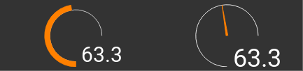
Bar and pointer
<group nowidget="true">
    <layout colspan="4" rowspan="2"/>
    <roundbar>
        <layout colspan="2" rowspan="2"/>
        <address transform="DPT:9.001" mode="read">3/3/1</address>
    </roundbar>
    <roundbar format="%.1f">
        <layout colspan="2" rowspan="2"/>
        <address transform="DPT:9.001" type="pointer" radius="50" width="-50" thickness="3" mode="read">3/3/1</address>
    </roundbar>
</group>
Marking
To partition the axis markings can be used. The values for the big (major) markings can be chosen freely, the small (minor) markings are evenly distributed.
Big and small markings
<roundbar majorradius="35" majorwidth="15" majorposition="0;20;40;60;80;100" minorradius="45" minorwidth="5" minorspacing="5" format="%.1f">
    <layout colspan="2" rowspan="2"/>
    <address transform="DPT:9.001" mode="read">3/3/1</address>
</roundbar>
Labels
The axis can be labeled with different ways. For this the attribute labels must contain the values separated
by a semicolon:
labels="0;20;40;80;100"
Each value can have an individual radius as well as an individual text to display:
value,radius
value,radius,text
Also the position (outside, center and inside) as well as the orientation
(horizontal, parallel, perpendicular, roundstart, roundmiddle and roundend) can be chosen
and put in front of the text, separated by a colon:
position:value
,orientation:value
position,orientation:value
It is sufficient to put the position, the orientation and also the radius just in front of the first value, all following values are inheriting this property. For special effects it’s possible to change these properties multiple times:
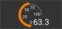
Labels
<roundbar labels="inside:0,44;25;50;75;100" majorradius="45" majorwidth="5" majorposition="0;25;50;75;100" minorradius="48" minorwidth="2" minorspacing="5" format="%.1f">
    <layout colspan="2" rowspan="2"/>
    <address transform="DPT:9.001" mode="read">3/3/1</address>
</roundbar>
Ranges
To have a quick overview of the current value it is possible to mark value ranges by a color. For this the
ranges attribute needs a list of range definitions that is separated by a semicolon.
Each range itself consists out of a list that is separated by colons:
value,radius,width,color
start...end,radius,width,color
Example:
ranges="0...70,63,3,green;70...100,63,3,red;70,60,9,#ff0"
This defines three ranges. First one for the values between 0 and 70 with a green arc of radius 63 and a
width of 3. Then a red arc from 70 to 100, also with radius 63 and a width of 3. Last a line is drawn at
value 70 that goes out from radius 60 for 9 units and has the color #ff0 which is a bright yellow.
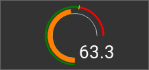
Ranges
<roundbar ranges="0...70,63,3,green;70...100,63,3,red;70,60,9,#ff0" format="%.1f">
    <layout colspan="2" rowspan="2"/>
    <address transform="DPT:9.001" mode="read">3/3/1</address>
</roundbar>
Tips
Presets
To simplify the configuration there are preset designs. All details of a preset can be overruled by the configuration file.
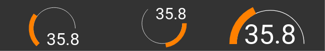
Preset “A”, “B” and “bridge”
<group nowidget="true">
    <roundbar preset="A">
        <layout colspan="2" rowspan="2"/>
        <address transform="DPT:9.001" mode="read">3/3/1</address>
    </roundbar>
    <roundbar preset="B">
        <layout colspan="2" rowspan="2"/>
        <address transform="DPT:9.001" mode="read">3/3/1</address>
    </roundbar>
    <roundbar preset="bridge">
        <layout colspan="2" rowspan="2"/>
        <address transform="DPT:9.001" mode="read">3/3/1</address>
    </roundbar>
</group>
Debug mode
The Roundbar widget tries to fill in the available space as big as possible. To be able to do so it must know already during the creation of the visu page how big its content can become. Especially for the text parts like the labels or the value this is not possible in an automated way.
For this the attribute bboxgrow can add to the automatically determined value a user specified distance.
When it contains a single number this will be added on all sides simultaneously. Separated by a semicolon it is
possible to add specific distances for horizontal;vertical. And for special effects each side can be adjusted
individually by left;up;right;down.
To be able to reach a good result quicker, especially as it is an iterative effort to get the best numbers, the
attribute debug can be set to true to get a blue frame to see the automatically derived dimensions and a
green frame for the final dimensions.
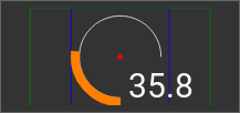
Activated debug mode
<roundbar debug="true" bboxgrow="50;0">
    <layout colspan="2" rowspan="2"/>
    <address transform="DPT:9.001" mode="read">3/3/1</address>
</roundbar>
Footnotes